【概要】
化粧品ボトルの3Dモデリングを通して、製品としての美しさと完成度の両立を目的に制作しました。
化粧品ボトルの3Dモデリングを通して、製品としての美しさと完成度の両立を目的に制作しました。
【制作情報】
使用ツール:Autodesk Maya / Photoshop
担当:モデリング・テクスチャ・レンダリング
制作期間:2週間
重点:形状バランス / 質感表現 / ディテール設計
使用ツール:Autodesk Maya / Photoshop
担当:モデリング・テクスチャ・レンダリング
制作期間:2週間
重点:形状バランス / 質感表現 / ディテール設計
【詳細】
シンプルな形状の中でも高級感が伝わるよう、全体のプロポーションやカーブの流れを細かく調整しました。
シンプルな形状の中でも高級感が伝わるよう、全体のプロポーションやカーブの流れを細かく調整しました。
また、実際の製品として成立することを意識し、パーツの構成や形状のつながりを考えながらモデリングを行っています。
マテリアルやライティングにおいても、質感や清潔感が自然に伝わるよう工夫しました。
マテリアルやライティングにおいても、質感や清潔感が自然に伝わるよう工夫しました。
BRAND: Re.NB
自然の力で本来の美しさを引き出し、肌に新たな生命を吹き込むことを目指している。
Aiming to draw out your natural beauty with the power of nature, breathing new life into your skin
自然の力で本来の美しさを引き出し、肌に新たな生命を吹き込むことを目指している。
Aiming to draw out your natural beauty with the power of nature, breathing new life into your skin
デザインコンセプトの設定
このプロジェクトでは、ハイブランドをターゲットとした商品ラインに向けて、シンプルでありながら角張った洗練されたデザインのボトルを目指しました。ミニマルでありつつも、エレガントさを兼ね備えたデザインを重視しました。
For this project, the goal was to create a bottle design for a high-end product line that embodies simplicity while maintaining a sharp and sophisticated aesthetic. The design focuses on minimalism, yet it is infused with an elegant touch.
このプロジェクトでは、ハイブランドをターゲットとした商品ラインに向けて、シンプルでありながら角張った洗練されたデザインのボトルを目指しました。ミニマルでありつつも、エレガントさを兼ね備えたデザインを重視しました。
For this project, the goal was to create a bottle design for a high-end product line that embodies simplicity while maintaining a sharp and sophisticated aesthetic. The design focuses on minimalism, yet it is infused with an elegant touch.
ムードボードの作成とカラー選定
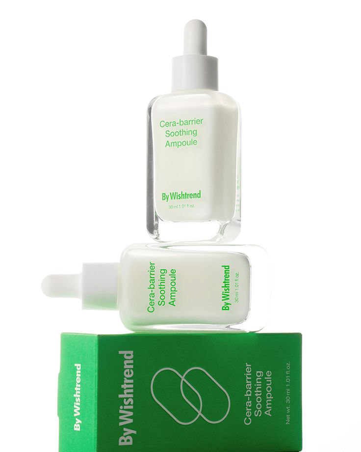
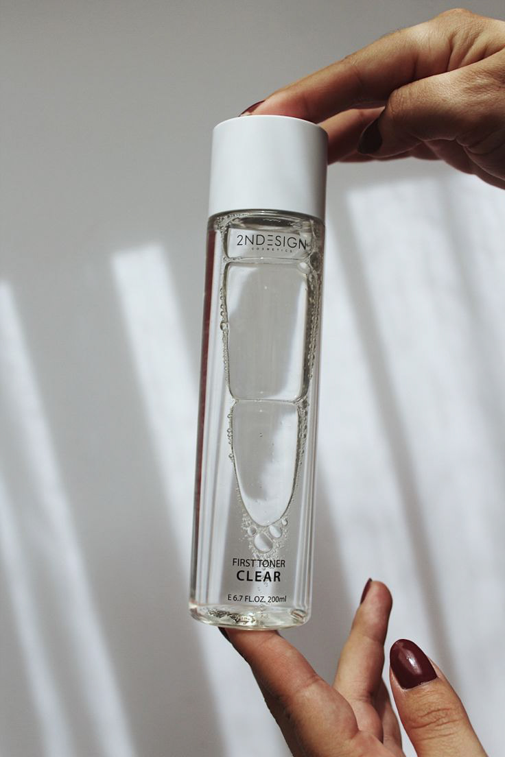
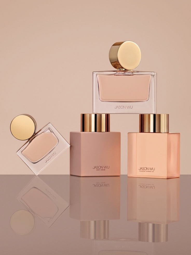
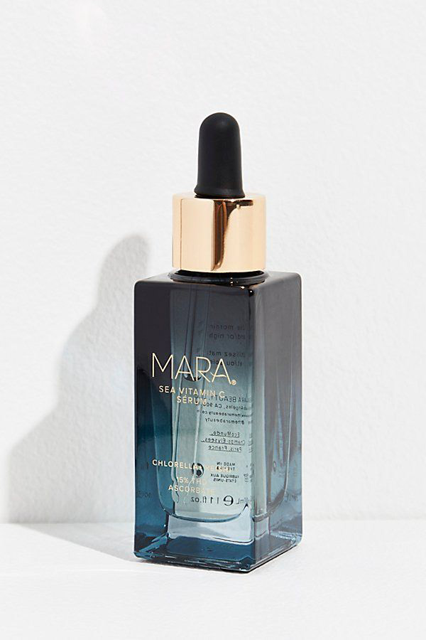
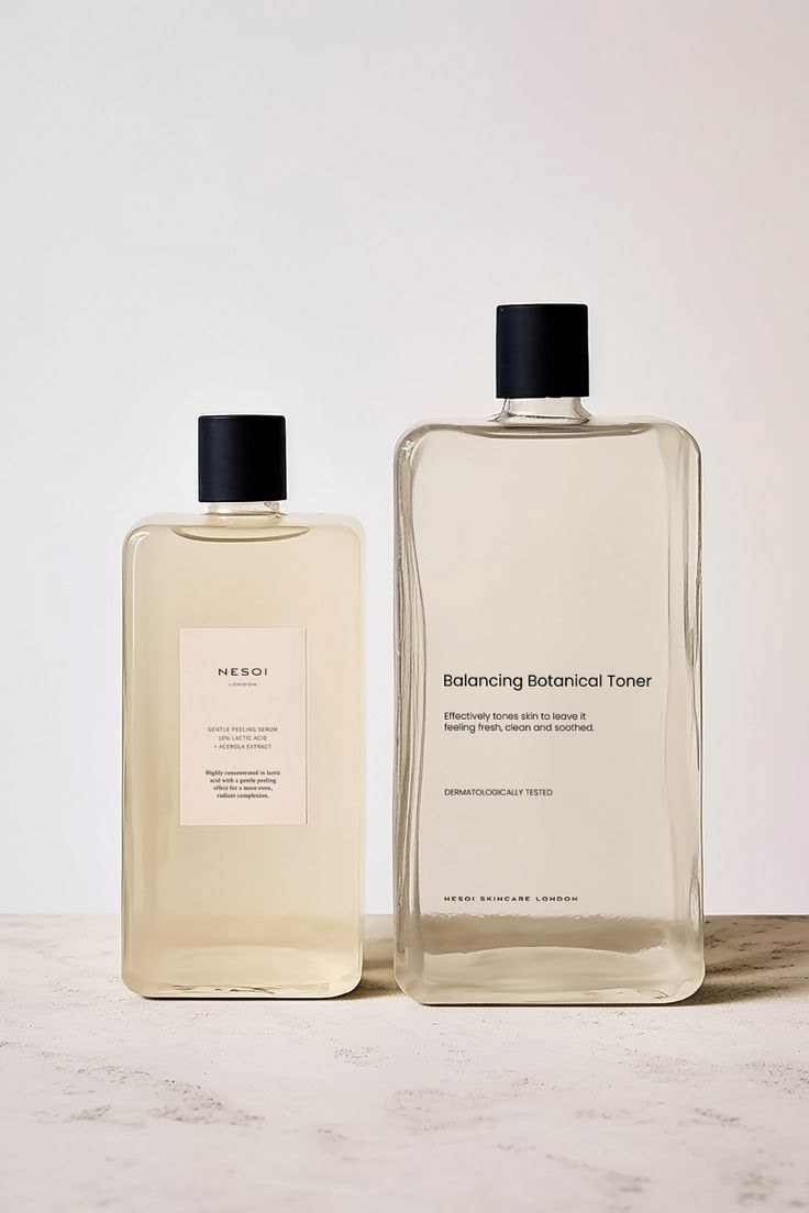
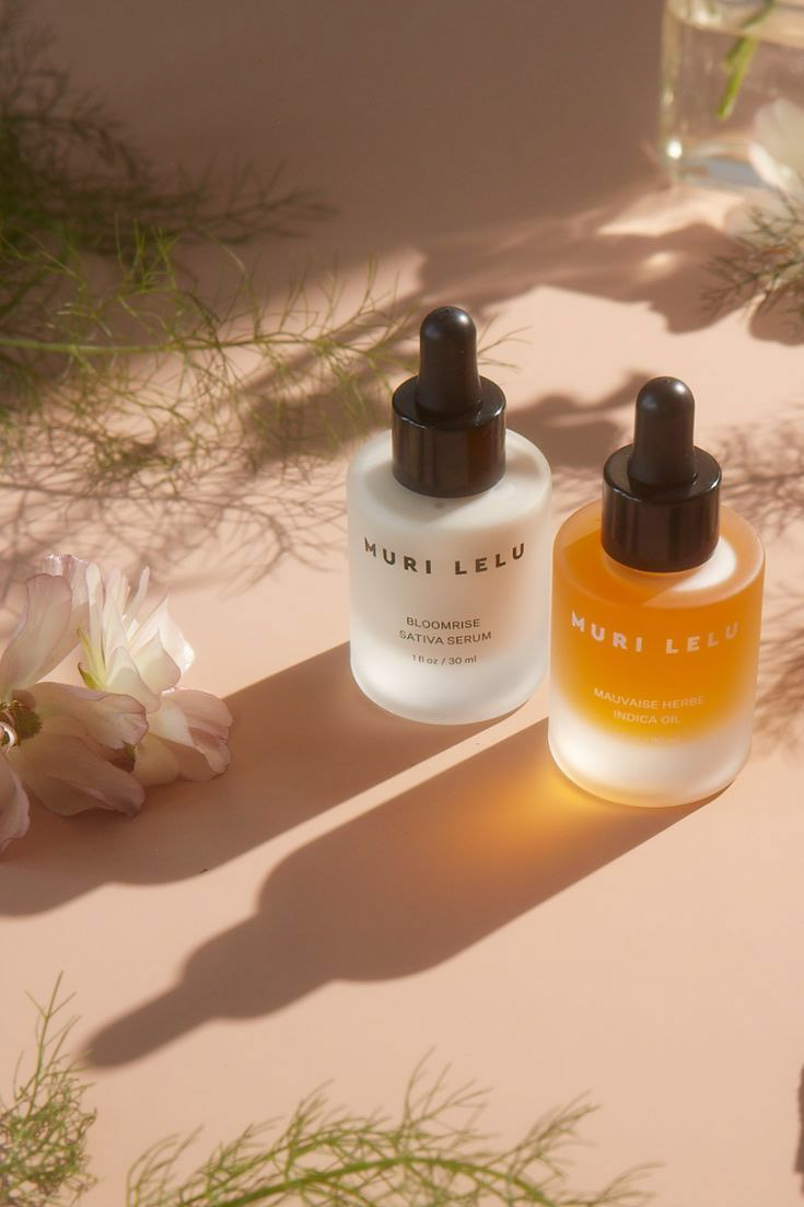
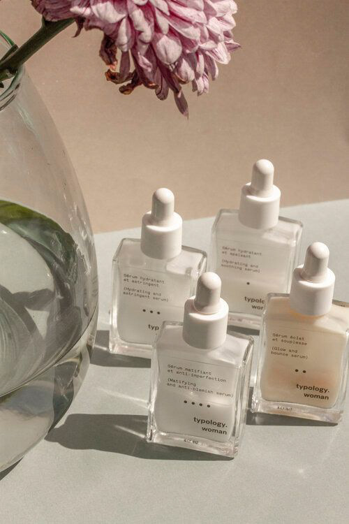
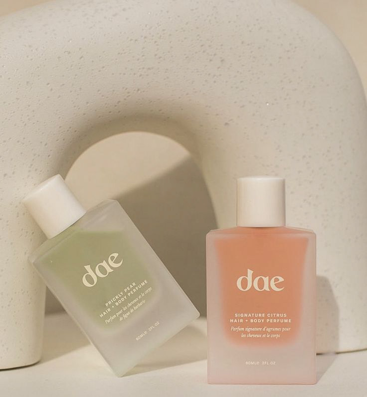
Bottle Moodboard
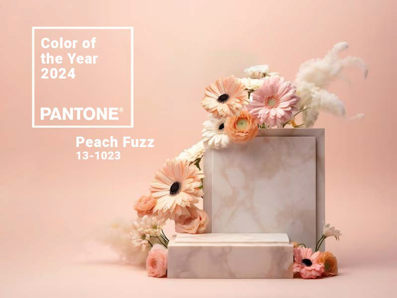
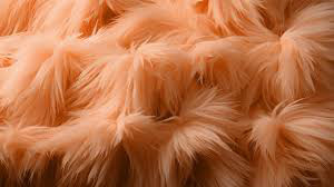
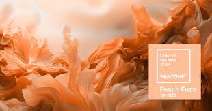
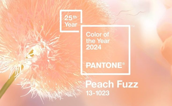
ボトルのメインカラーとして、2024年のPantoneカラーである「Peach Fuzz」を選びました。この色は、暖かく明るいトーンを持ち、柔らかなピンクと控えめなオレンジの組み合わせが、女性らしさとモダンさを両立しています。「Peach Fuzz」は単なる色以上に、ブランドが掲げる「フレンドリーでナチュラル」という理念に合致する、フレッシュで生命力あふれる象徴です。
I created a moodboard and selected the 2024 Pantone Color of the Year, Peach Fuzz, as the primary color for the bottle. This tone brings a warm and bright feeling. The combination of soft pink and light orange creates a color that is both feminine and modern. Peach Fuzz is not just a color, but a symbol of freshness and vitality, which aligns perfectly with the brand's values of being friendly and natural.
I created a moodboard and selected the 2024 Pantone Color of the Year, Peach Fuzz, as the primary color for the bottle. This tone brings a warm and bright feeling. The combination of soft pink and light orange creates a color that is both feminine and modern. Peach Fuzz is not just a color, but a symbol of freshness and vitality, which aligns perfectly with the brand's values of being friendly and natural.
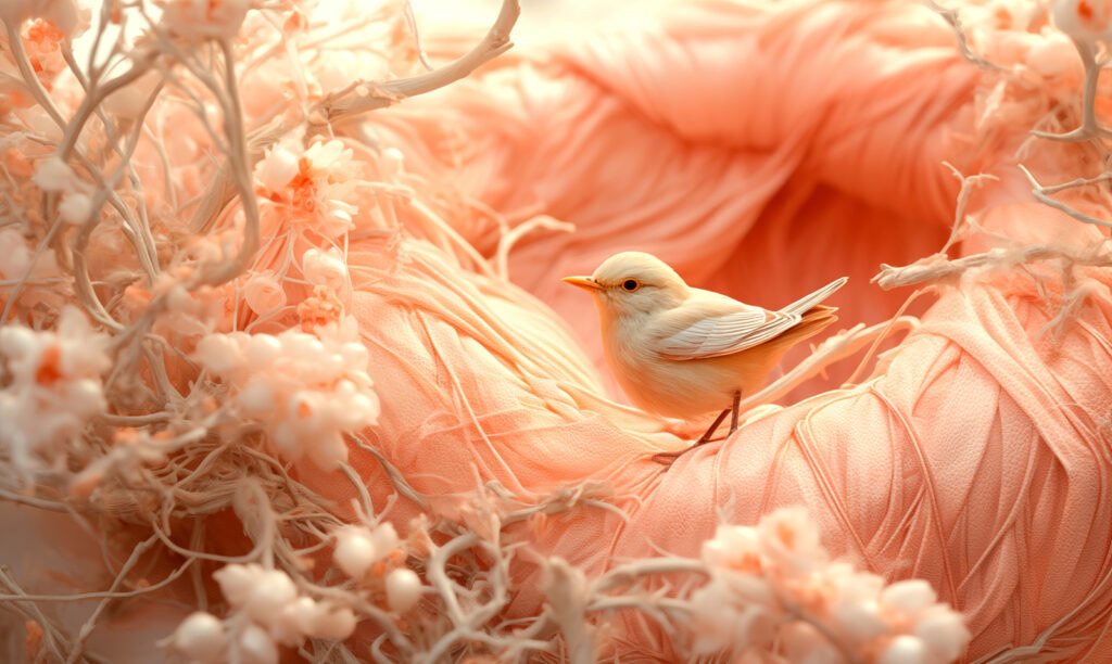
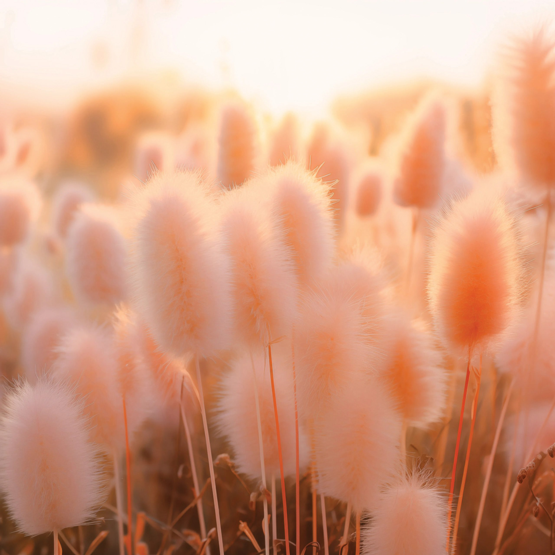
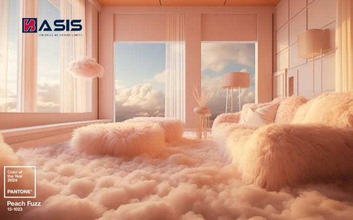
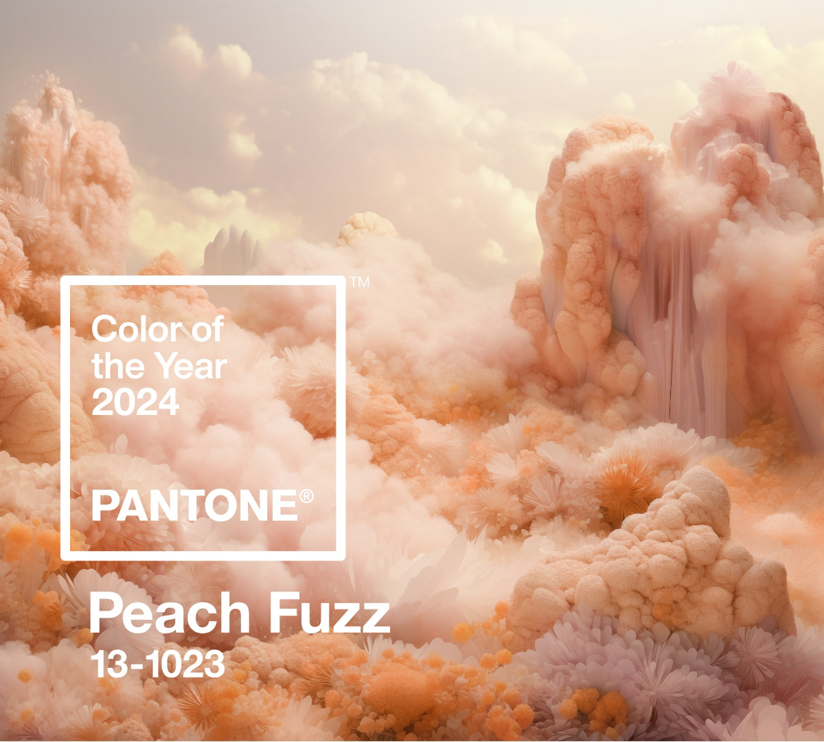
Color Moodboard
ボトルのスケッチと寸法設計
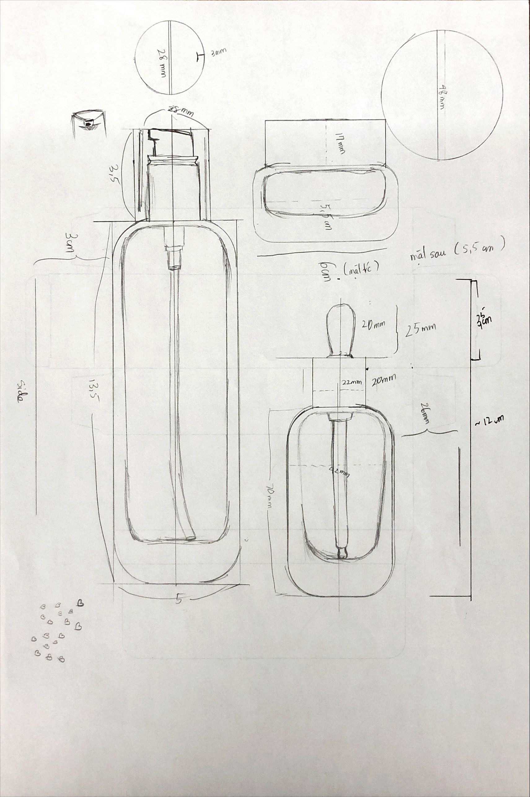
ボトルの形状とサイズを詳細にスケッチしました。角度やプロポーションにこだわり、デザインの全体像を明確にしました。
I sketched the bottle and finalized the dimensions, outlining the key design features.
ボトルの形状とサイズを詳細にスケッチしました。角度やプロポーションにこだわり、デザインの全体像を明確にしました。
I sketched the bottle and finalized the dimensions, outlining the key design features.
Mayaを使用した3Dモデリングとテクスチャ作成
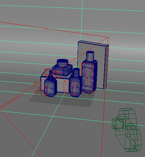
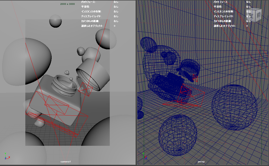
Autodesk Mayaを使用して、スケッチに基づいたボトルの3Dモデルを作成しました。その後、リアルな質感を持たせるためにテクスチャを作成し、素材感や光の反射を忠実に再現しました。
Using Autodesk Maya, I created a 3D model and applied textures to the design.
Autodesk Mayaを使用して、スケッチに基づいたボトルの3Dモデルを作成しました。その後、リアルな質感を持たせるためにテクスチャを作成し、素材感や光の反射を忠実に再現しました。
Using Autodesk Maya, I created a 3D model and applied textures to the design.
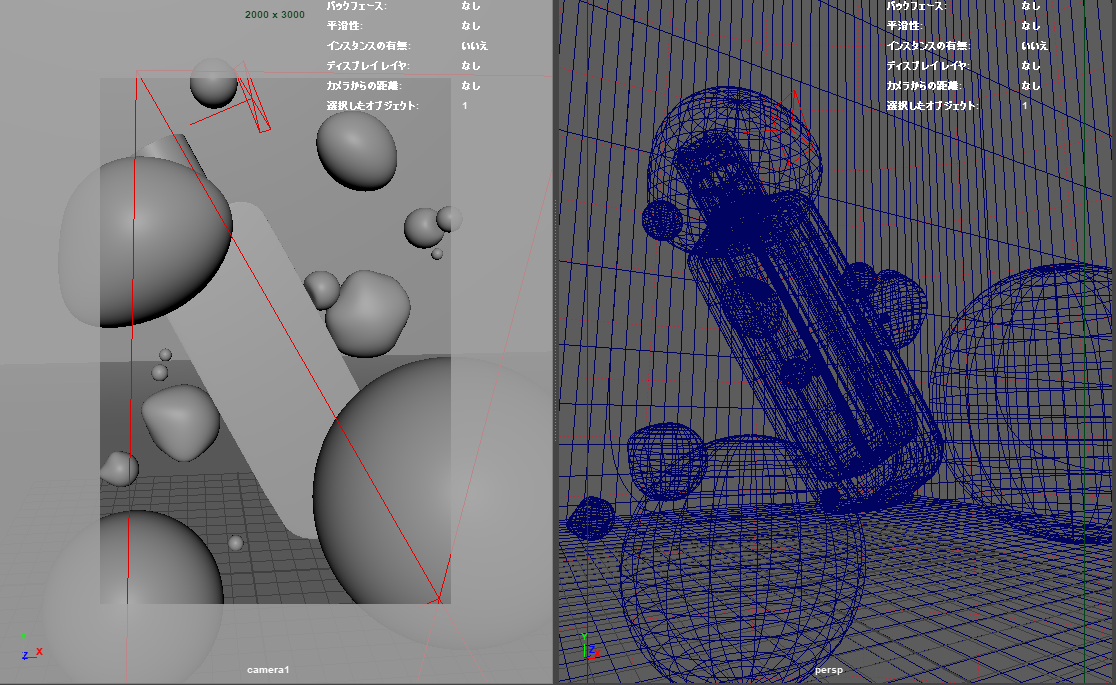
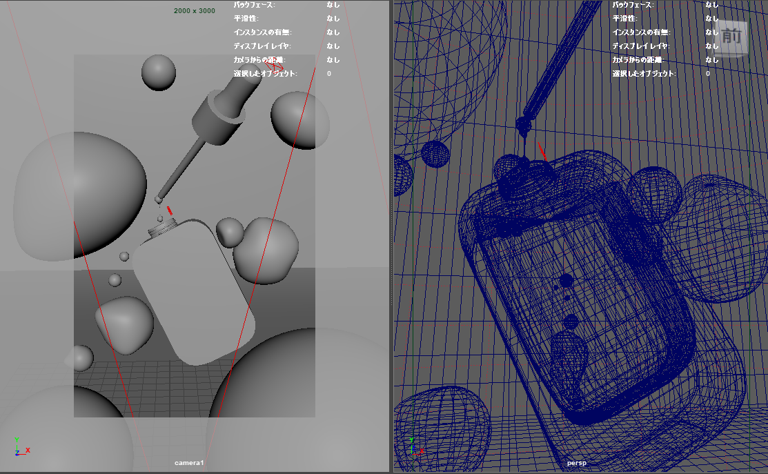
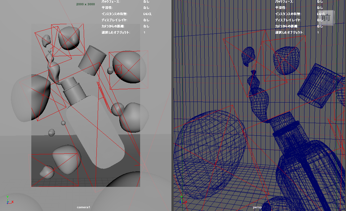
ライティングとレンダリング
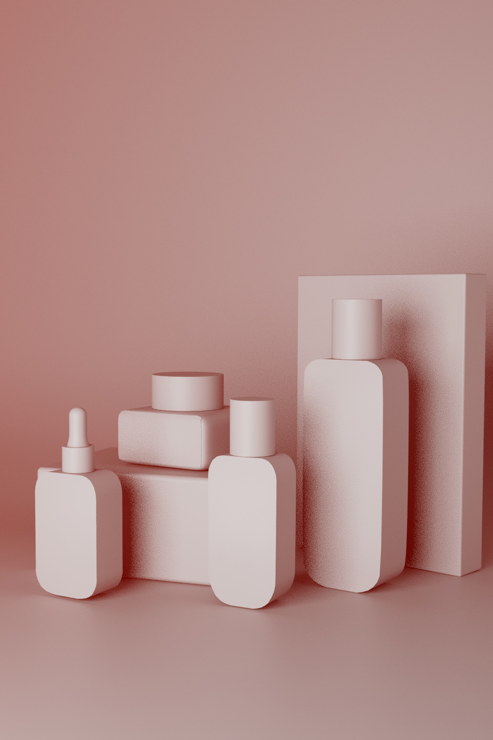
ライティングを設定し、ボトルの形状やテクスチャが際立つように光を調整しました。スタジオライティングを使用して、プロフェッショナルな見栄えのレンダリングを行いました。
I set up lighting to enhance the bottle's shape and texture and then rendered the scene.
ライティングを設定し、ボトルの形状やテクスチャが際立つように光を調整しました。スタジオライティングを使用して、プロフェッショナルな見栄えのレンダリングを行いました。
I set up lighting to enhance the bottle's shape and texture and then rendered the scene.
Photoshopでの仕上げ
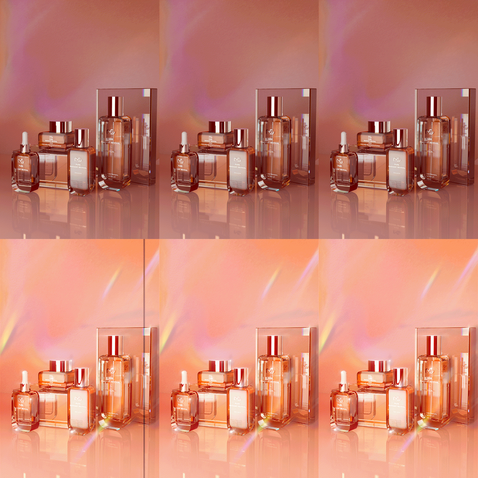
最後に、レンダリングした画像をPhotoshopで編集し、色調やコントラストの微調整を行いました。これにより、製品の魅力が最大限に引き出される画像に仕上げました。
Lastly, I used Photoshop to fine-tune the rendered image, adjusting colors and contrast to complete the final design.
最後に、レンダリングした画像をPhotoshopで編集し、色調やコントラストの微調整を行いました。これにより、製品の魅力が最大限に引き出される画像に仕上げました。
Lastly, I used Photoshop to fine-tune the rendered image, adjusting colors and contrast to complete the final design.
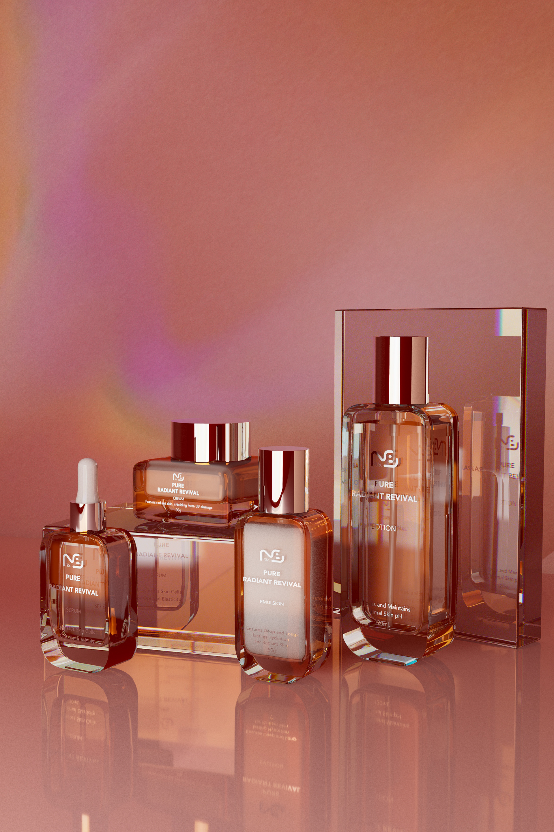
Before
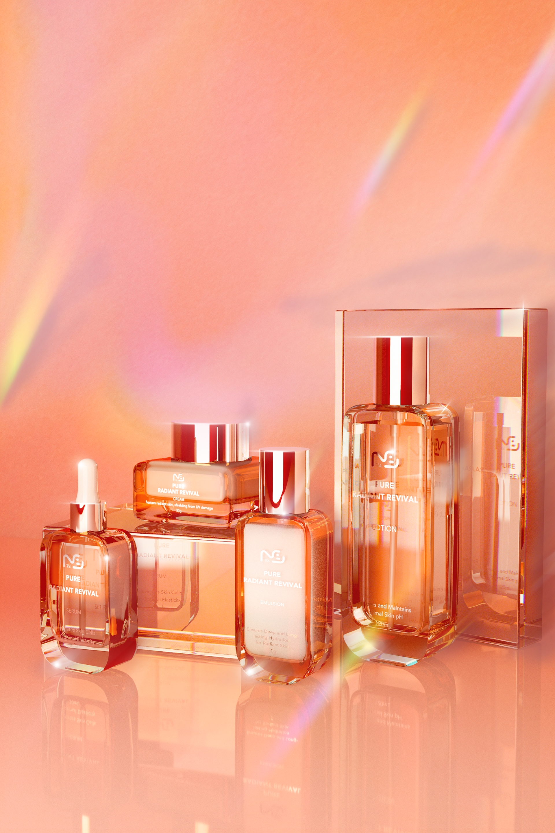
After
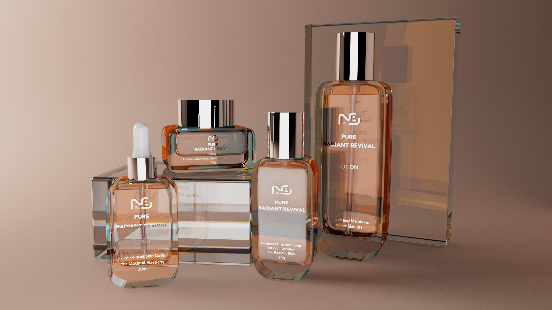
Before
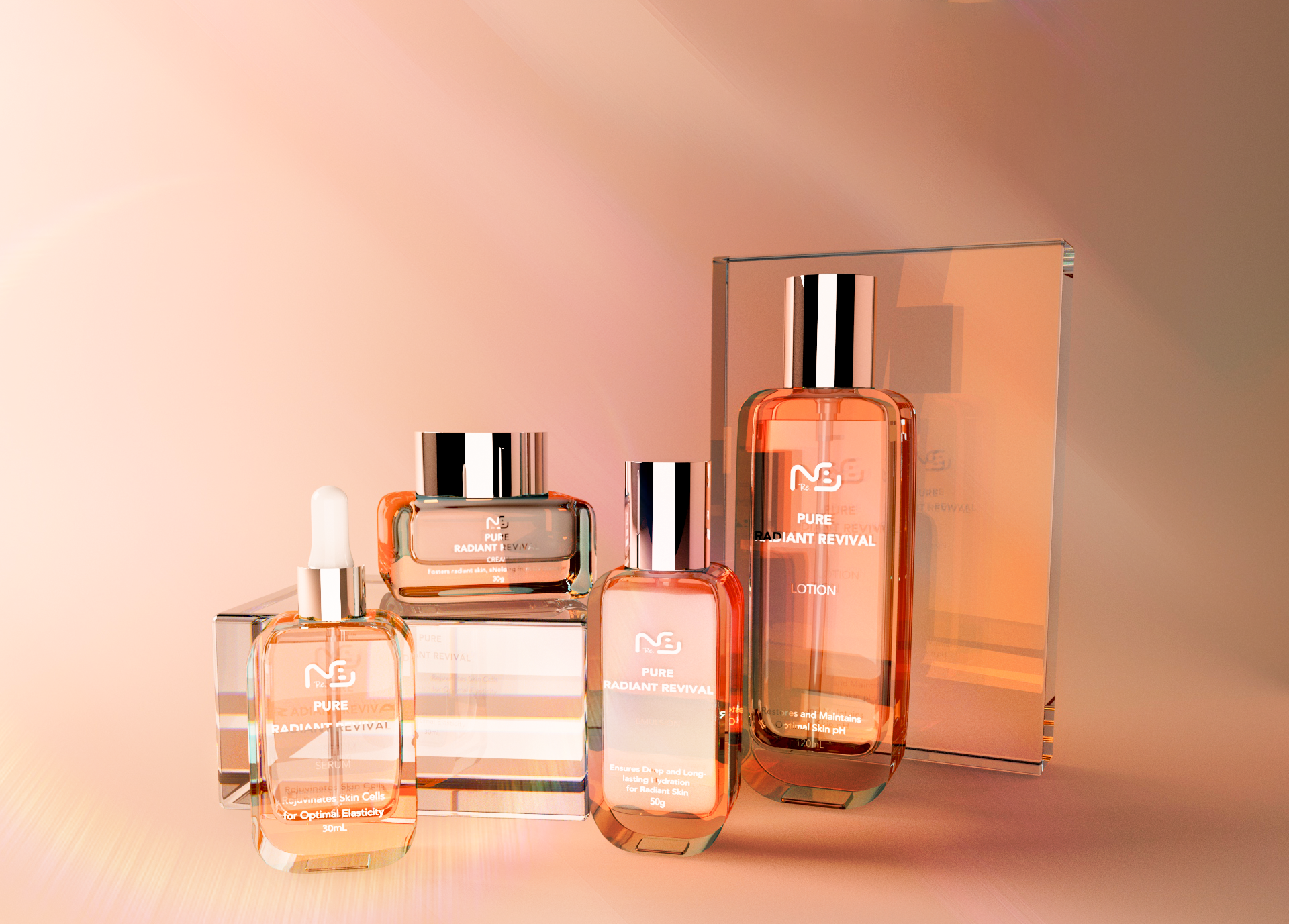
After
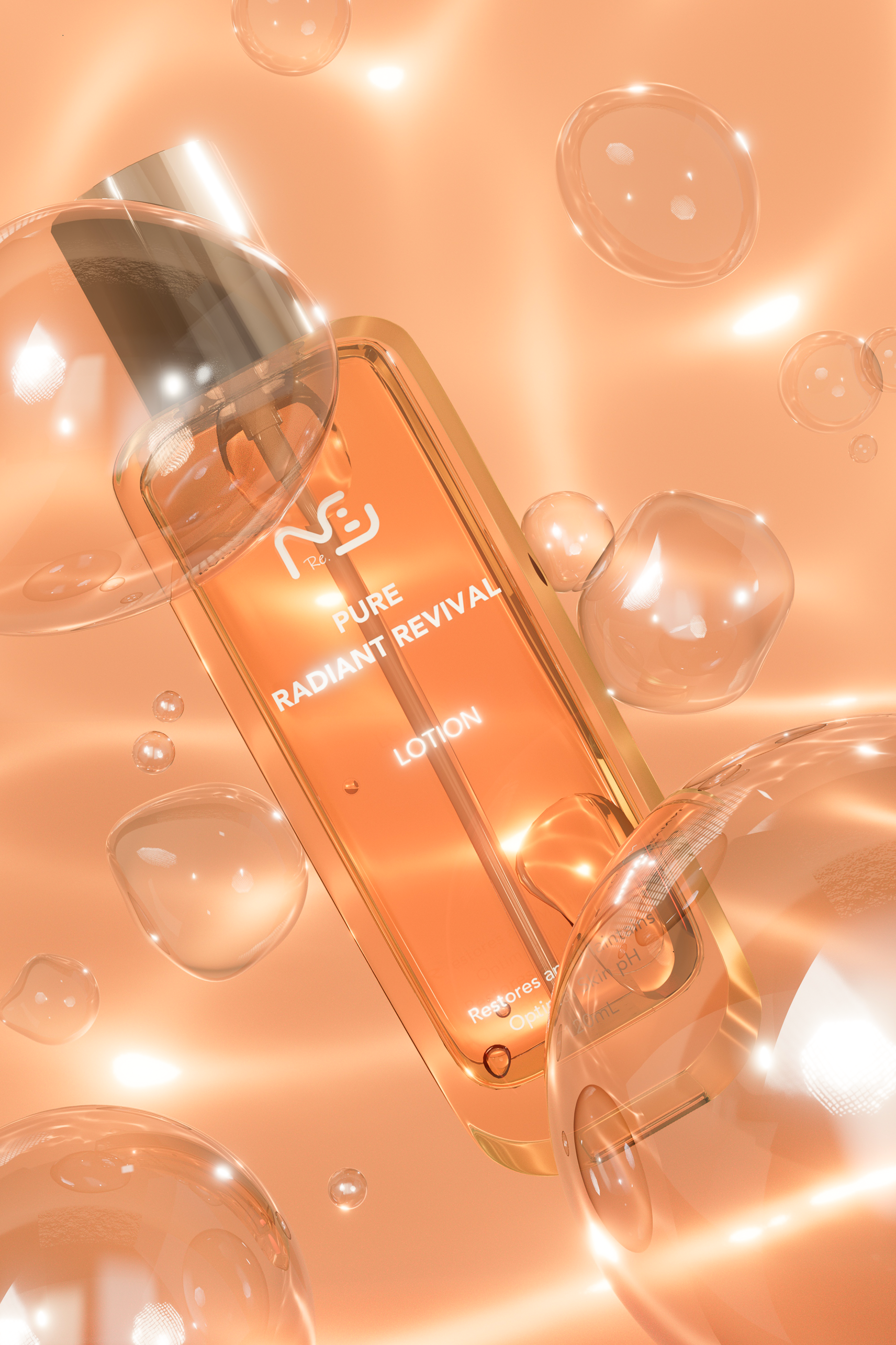
Lotion
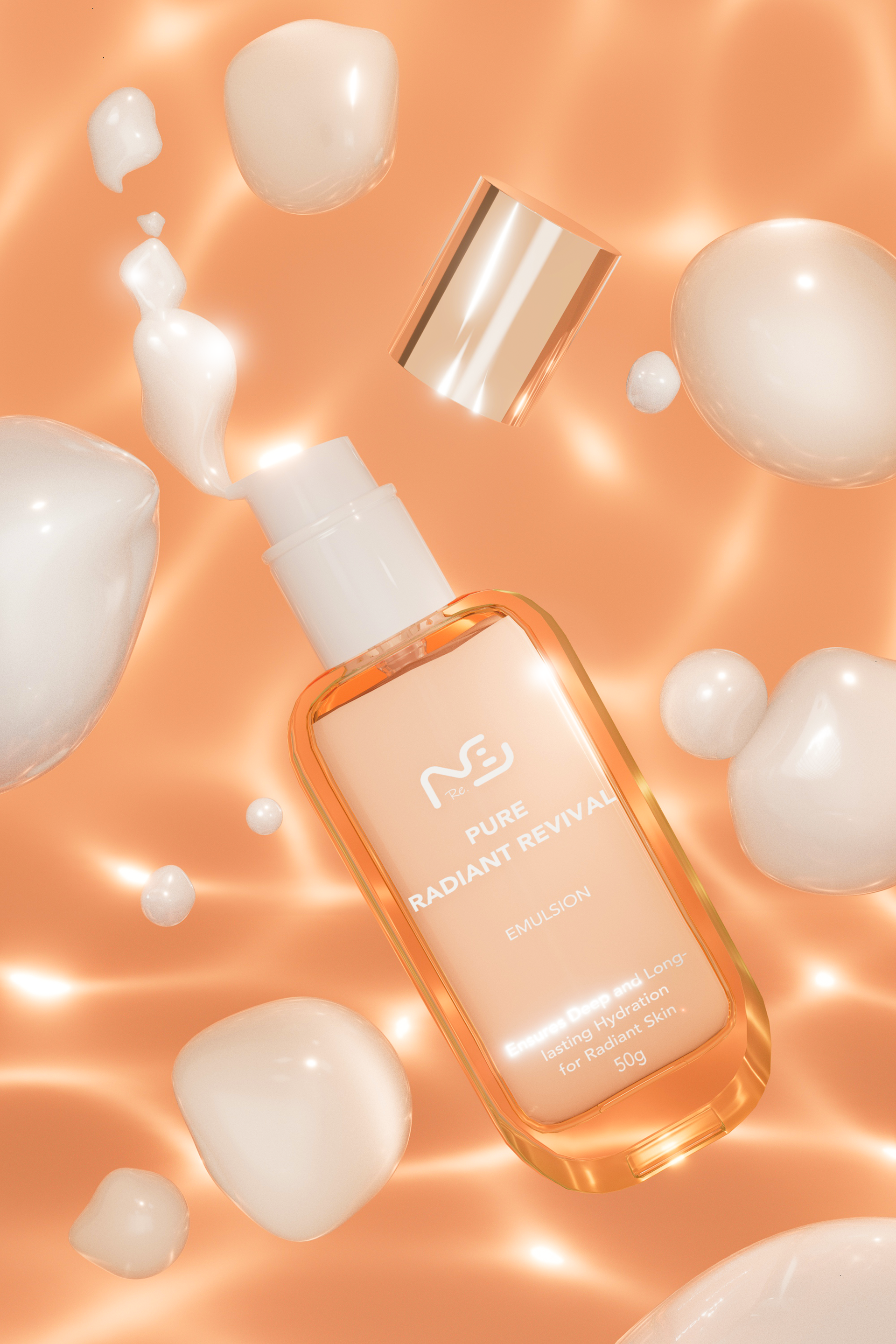
Emulsion
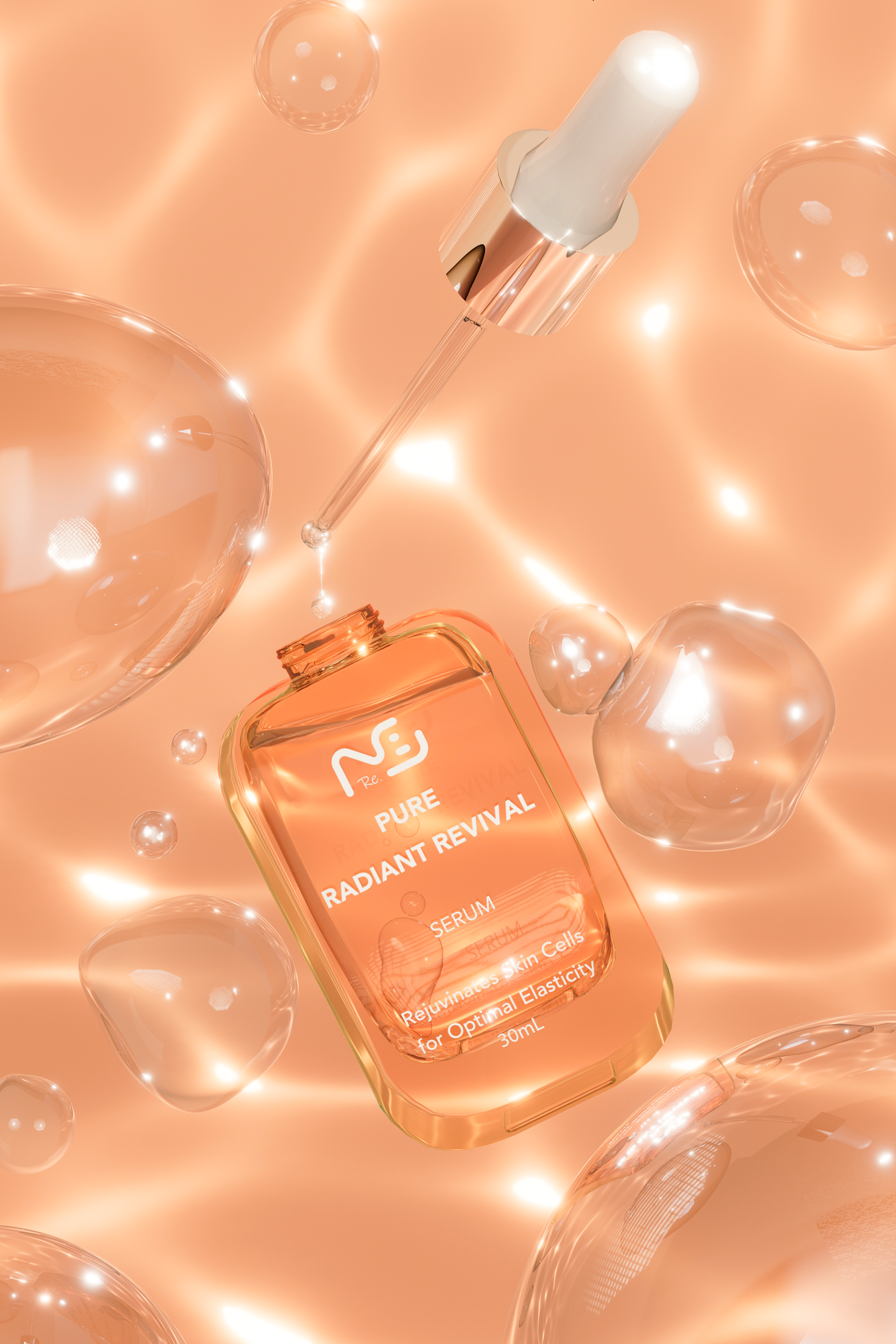
Serum
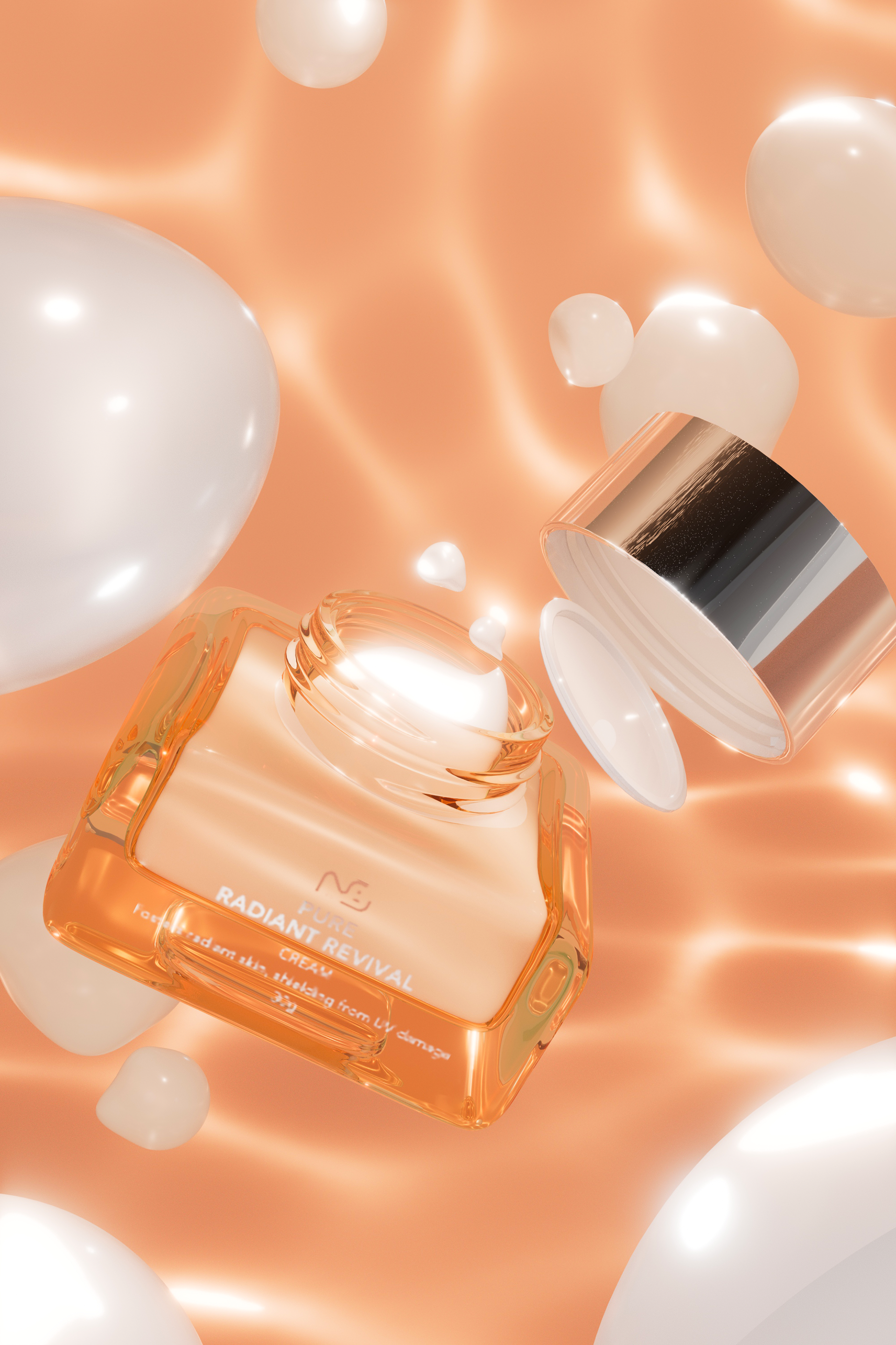
Cream
Project: Re.NB Brand Cosmetic 3D Photography
Client: Re.NB
Designed by: VU BACH DIEU QUYNH
Tools: Autodesk Maya, Illustrator, Photoshop
Client: Re.NB
Designed by: VU BACH DIEU QUYNH
Tools: Autodesk Maya, Illustrator, Photoshop